Histogram
Histograms are often used to visually represent continuous data.
Syntax
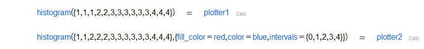
histogram(Statistics_data)
Description
It draws a histogram for a data sample.
 |
|
Options
Option | Description | Format | Default value |
|---|---|---|---|
axis_label | A list of two labels for the x and y axes. | Two Strings | |
close_right | When set to | Boolean | |
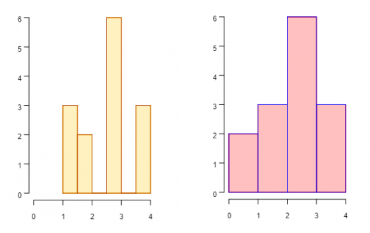
color | Sets the color of the outline of the histogram bars. | RGB list of values | |
fill_color | Sets the color of the inside of the histogram bars. | Same as the | |
frequencies | When set to true, the y-axis shows the absolute frequency of the values on the x-axis. When false, the y-axis shows relative frequency. | Boolean. | |
intervals | Use this option to specify where histogram bars are delimited. | List of the exact values where histogram bars start and end, an algorithm that computes those values ( | |
show_axis | When set to true, it shows both x and y axes. If false, it shows no axes. | Boolean. | |
show_label | When set to true, it shows a label above each bar with the corresponding y-value. | Boolean. | |
title | Title to be displayed above the histogram. | String. | |
x_limits | List of two numbers to be used as the minimum and maximum values displayed on the x-axis. | Two Floats | |
y_limits | List of two numbers to be used as the minimum and maximum values displayed on the y-axis. | Two Floats | |